Contemplating a book cover redesign? I hemmed and hawed about that for months. I was happy with the book cover design for my thriller, “She’s Gone“, but there was always something gnawing me about that cover and I couldn’t quite put my finger on it until months after it was published.
Does Your Book Cover Represent Your Genre Well?
That was the question that was bugging me. Did my book cover represent my genre (thriller) and sub-genre/Amazon categories (vigilante justice, crime) clearly:

It took awhile for it to dawn on me that my old cover was giving off a romance vibe to it. The title and the cover really didn’t make it clear to fans of hard-pounding, non-stop action thrillers that She’s Gone was just that.
Instead, it might cause pause and in this business, perspective readers, do judge your book by its cover. But I still hemmed and hawed about moving forward with a book cover redesign. My book was selling. I liked the cover. I had received unsolicited positive comments about the cover. Why change it?
Book Cover Redesign
A few weeks ago the whole “should I or should I not” internal debate I was having about the book cover redesign came to a head when I read a blog post by Diana Urban with BookBub (they know how to sell books) about this exact subject: How to Know Your Book’s Cover Needs a Redesign. It was as if she was talking to me directly.
After reading that blog post, I bounced the idea off of colleagues at a couple of the writer’s forums that I haunt and the consensus was that the cover for “She’s Gone” did have a romance genre vibe to it and didn’t really scream out thriller.
That was it. I made the decision to move forward with the book cover redesign.
Branding
I was concerned about the branding of my covers since there are certain branding elements that I’m using (darker look, the typography, etc.) for all my book covers (three so far and I’m planning to continue with that branding on future covers):

So starting from scratch didn’t make sense (especially since I did like the old cover). I decided to redesign the current cover. Keep most of it but adding new imagery that would leave no question that my book was a thriller.
I reached out to the talented designer who had designed the original book cover. He was available, so I sent him a Word doc with my ideas (I recommend doing this so that the designer has a clear idea what you’re after).
Here was the gist of what I was looking for:
- Remove the romance genre vibe so there isn’t a doubt that She’s Gone is a hard-charging thriller
- Add a silhouetted man with a gun (similar to what’s on my other two covers)
- And add some color (I wanted to add a little color to the monochrome look and feel). I wanted red, so I thought a blood splatter effect would look nice.
In a few days the designer came up with three cool concepts:
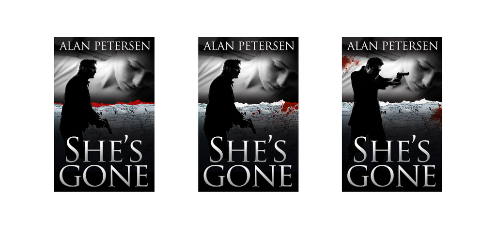
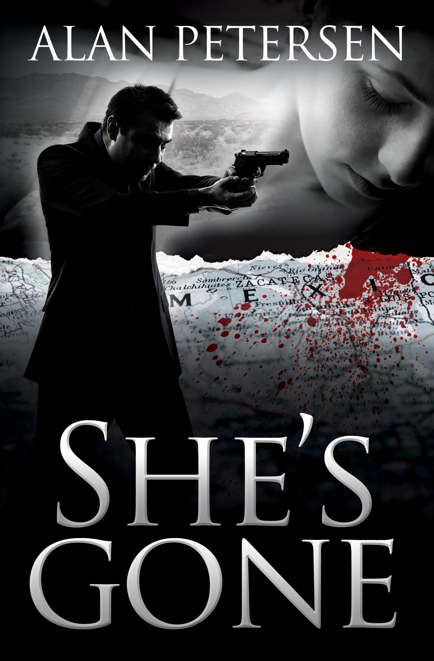
I liked elements from design #2 and #3 best, so I asked him to swap some of the images between those two covers and to move some things around and he came up with a cover that I really liked. One that hits the thriller genre in the head:
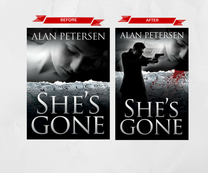
Before and After

I’m happy with the new book cover. I believe it addressed the genre identification problems I was seeing with the old cover. There isn’t doubt that this is a cover for a thriller book. I feel more reassured that as potentials readers peruse Amazon looking for a new thriller to read that the new cover for “She’s Gone” will make it easier for them to id it as a thriller book making them stop for a few extra precious seconds to make the decision on whether or not to give my book a chance.
Results
I just (yesterday) uploaded the new cover up to Amazon (for now, the digital version of my books are only available on Amazon) so it’s way too soon to know if the book cover redesign will have an impact on sales (pro or con), but I will be keeping a close eye on that and I will follow up with a results oriented post in a few months.






 My name is Alan Petersen I write mysteries and thrillers. You can check out my Amazon page